Newsletter Subscribe
Enter your email address below and subscribe to our newsletter

 ByJohn A
Turning a website visit into a purchase rarely depends on one dramatic redesign. More often, the difference comes from a series of small improvements that make it easier for people to understand an offer, find answers, and feel confident taking action. An ai chatbot for business can be one part of that experience, helping visitors get timely answers while they are exploring rather than leaving them to search through pages or wait for a reply.
The first improvement is clarity. Within seconds of landing on a page, visitors should be able to tell what the business offers, who it serves, and what they can do next. A focused headline, concise supporting text, and a visible call to action reduce the effort required to make sense of the page. When visitors have to decode vague language or hunt for the next step, even a strong offer can be overlooked.
Navigation is another detail with an outsized effect. Menus should use familiar labels, group related information logically, and avoid giving every page equal prominence. A visitor comparing services should be able to move between relevant pages without losing their place. For teams considering the best chatbot for website support, it is useful to think of chat as an additional navigation aid: it should help people reach relevant information, not distract them from the page or interrupt their task.
Product and service pages should answer the questions people naturally ask before committing. Clear descriptions, transparent pricing or pricing guidance, practical details, and relevant examples help visitors assess whether an offer fits their needs. If important information is missing, customers may delay their decision or contact a competitor that makes the details easier to find.
See also: How to Learn Artificial Intelligence Step by Step
Small trust signals can also make a meaningful difference. Authentic testimonials, recognizable client examples, secure payment indicators where relevant, and straightforward contact information reassure visitors that a real business stands behind the website. These elements work best when they are specific and easy to verify. Overstated claims or an overload of badges can have the opposite effect by making a page feel less credible.
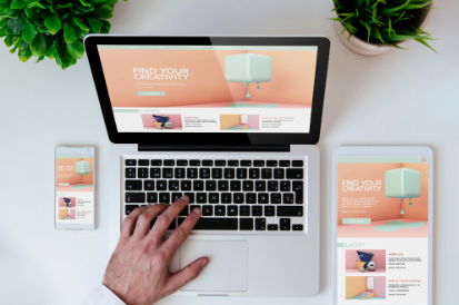
The mobile experience deserves particular attention. Many people browse on a phone, where cramped layouts, tiny text, slow-loading pages, and awkward forms quickly become frustrating. Readable typography, comfortable spacing, buttons that are easy to tap, and forms that request only necessary information can remove friction without changing the visual identity of the site.
Page speed is another practical improvement. Large images, unnecessary scripts, and complicated page elements can make a site feel sluggish. Compressing media, removing unused features, and checking performance on mobile connections can make browsing smoother. A fast page does not persuade someone on its own, but a slow one can prevent them from engaging with the content in the first place.
Calls to action should be clear and consistent with the visitor’s level of intent. Someone who is still researching may respond better to a detailed service overview or a way to ask a question, while someone ready to buy may want a direct purchase or booking option. Repeating the same generic button everywhere can miss these differences. Matching the next step to the page context helps visitors move forward naturally.
Forms and checkout flows are worth reviewing from the customer’s perspective. Remove fields that are not essential, explain why sensitive details are needed, and make errors easy to correct. Show costs and important conditions before the final step. A simple progress indicator or clear confirmation can also reduce uncertainty, especially when a process involves several stages.
The most useful website improvements are the ones that respond to real visitor behavior. Review analytics, search terms, customer questions, and points where people leave a page or abandon a process. Test one meaningful change at a time when possible, and look beyond clicks to outcomes such as completed enquiries, bookings, or purchases. A website does not need to be rebuilt every time performance stalls. Often, making the experience clearer, faster, and more helpful is enough to turn more browsing into confident action.